Hidden Stories in Postmark Dates and Stamps

Have you ever looked at a vintage postcard and wondered why the date on the stamp doesn't match the date written in the handwritten note? Postmarks and cancellations aren't just messy ink smudges; they are the fingerprints of history that tell you exactly when and where a piece of paper traveled. This post looks at how to read postmarks, the difference between various cancellation types, and how these tiny details can change the value of your collection.
Understanding these markings helps you verify the authenticity of a piece. It also helps you identify specific eras of postal history that might be more valuable than the image on the front of the card. If you're trying to figure out if a card is truly from the 1910s or a much later reproduction, the postmark is your best friend.
What is a Postmark and Why Does It Matter?
A postmark is a postal marking used to cancel a stamp and provide a date and location of mailing. While the image on your postcard might be a beautiful view of the Grand Canyon, the postmark tells the real story of the human connection behind it. It serves two main purposes: it prevents the reuse of postage and it provides a temporal anchor for the object.
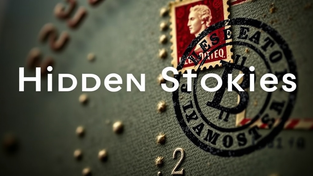
Collectors often focus on the "front" of the card—the glossy or linen texture, the art, and the color. But the "back" is where the technical data lives. A clear, crisp postmark can actually increase the desirability of a piece for postal historians. If a card has a "circular date stamp" (CDS) that is perfectly legible, it proves the card was actually sent during the era it claims to be from.
There are several types of markings you'll encounter:
- The Cancellation: This is the heavy ink strike designed to "kill" the stamp so it can's be used again.
- The Date Stamp: This provides the month, day, and year.
- The Location Stamp: This identifies the specific city or post office branch.
- The Killer: A series of lines or dots used to obscure the stamp completely.
Sometimes, you'll see a "pictorial cancellation." These are much more interesting. Instead of just lines, the post office uses a small icon—like a tiny locomotive or a specific building—to cancel the stamp. These are highly sought after by specialists. If you're already learning the ropes, you might want to check out my guide to identifying postcard eras to see how these markings align with the physical paper quality.
How Do You Identify Different Types of Postal Markings?
You identify different markings by looking at the shape, the ink color, and the specific symbols used by the postal service. Most collectors start by recognizing the most common shapes: circular, oval, or rectangular. The complexity of the mark usually dictates its historical significance.
The United States Postal Service (and its predecessors) has used various methods over the decades to process mail. In the early 1900s, many marks were hand-stamped by clerks, leading to much more variation than the machine-struck marks we see today. This variation is why no two vintage postcards are ever truly identical.
Here is a breakdown of common markings you'll see in the field:
- CDS (Circular Date Stamp): The standard round mark containing the city and date.
- Slogan Cancels: These include text like "Thank You" or "Greetings from..." often used for promotional purposes.
- Dot/Dater Cancels: These are much simpler, often just a series of dots or a single line used to strike through the stamp quickly.
- Pictorial Cancels: These feature an illustration, often used for special events or specific geographic locations.
I've noticed that many beginners mistake a "smudge" for a meaningful mark. A smudge is just a failure of ink application. A true postmark has structure. It has edges. It has a clear intent. If you see a mark that looks like a tiny drawing, you've likely found a pictorial cancel, which is a much higher tier of collectible.
Can a Postmark Increase a Postcard's Value?
Yes, a postmark can increase value if it is a rare, clear, or historically significant cancellation. While most collectors want a "clean" card, a postal historian wants a "documented" card. A clear, dated postmark provides the "provenance" of the card's journey.
The value increase usually falls into three categories. First, there's the "Era Verification" category. If a card is from a period where many are lost or undocumented, a clear postmark acts as a certificate of authenticity. Second, there's the "Location" category. A postmark from a small, defunct post office in a ghost town is worth significantly more than one from a major hub like New York City. Third, there's the "Special Event" category. If a card was postmarked during a specific event—like the 1915 Panama-Pacific International Exposition—it becomes a historical artifact.
| Marking Type | Typical Value Impact | Why It Matters |
|---|---|---|
| Standard CDS | Neutral / Slight Increase | Confirms the age and location. |
| Pictorial/Slogan | Moderate Increase | Adds a decorative and historical element. |
| Rare/Defunct Office | High Increase | Extremely rare; highly sought by specialists. |
| Heavy/Illegible | Decrease | Hides the details that collectors want to see. |
It's worth noting that a "perfect" card isn't always the one with the cleanest back. If you're a collector of the paper itself, you might prefer a clean reverse. But if you're a historian, that ink is everything. Don't let a messy-looking stamp scare you away from a great find. Often, the "mess" is actually a highly detailed piece of evidence.
One thing to watch out for is "ink bleed." On thinner, older cardstock, the ink from the postmark can soak into the fibers, making it look blurry. This isn't a sign of a fake; it's just the nature of the paper. If you're buying high-end vintage pieces, look for "crisp" ink. You want to be able to read the town name without squinting. If you can't read it, the value is likely lower.
I often see people get frustrated when they find a card with a "bad" stamp. But look at it this way—the stamp is the only way the card "speaks" to us about its travels. It's the difference between a piece of paper and a piece of history. If you're just starting out, don't overthink it. Just learn to look for the details.
If you want to dive deeper into the physical aspects of your collection, you might find my ultimate guide to collecting vintage postcards helpful. It covers the broader spectrum of what to look for beyond just the ink.
The world of postal history is dense. It's a rabbit hole. But once you start seeing the difference between a standard cancellation and a rare pictorial strike, your entire collection changes. You aren't just looking at old mail anymore; you're looking at a map of human movement through time.